
TL;DR: I’m moving from ForeFlight to Garmin Pilot because it offers a cleaner, more ergonomic UI, genuinely rethought instrument charts (SmartCharts), better pricing without locking safety features behind the top tier, seamless Garmin avionics integration with valuable EIS data, and a company trajectory that feels focused on development rather than monetization.
Every pilot has their loyalties: Lycoming vs. Rotax, nosewheel vs. tailwheel, ForeFlight vs. Garmin Pilot. We love to argue about them in hangars, on forums, and at fly-ins. Since coming back to aviation last year, I’ve been flying with ForeFlight — it’s the standard everyone seemed to use, and for good reason.
But here’s the thing: tools age, design philosophies stagnate, and competitors catch up. As my ForeFlight subscription came up for renewal this year, I realized it might not be the best fit anymore. Garmin Pilot has been quietly (and sometimes not so quietly) building momentum with a steady stream of improvements. The result? A modern, contextual, and more integrated app that feels like it was designed for how pilots actually fly today.
So I’m breaking ranks: my ForeFlight days are over, and I’m moving to Garmin Pilot. Here’s why.
1. User Interface & Ergonomics
The biggest difference between Garmin Pilot and ForeFlight is design — and I don’t just mean “pretty icons.” Garmin Pilot has a deliberate, modern design philosophy that feels both beautiful and functional. ForeFlight, by contrast, shows its age. It’s clearly the product of a more conventional app design that’s been incrementally patched and improved over the years.
This isn’t just an aesthetic critique. The way Garmin Pilot is structured has direct consequences for ergonomics — how quickly and intuitively you can get to the information you need.
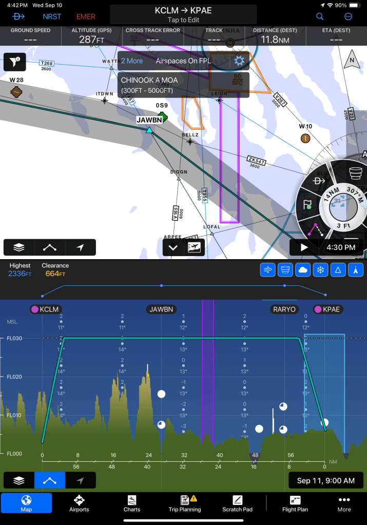
The most fundamental design concept in Garmin Pilot is its contextual paradigm. When you tap on the map, a menu wheel pops up with actions specific to the spot you touched. And here’s the key: if there are multiple relevant items under your finger — say an airport, an airway, and a piece of controlled airspace — Garmin Pilot shows them all in the same contextual menu. From there, you can drill into airport info (frequencies, procedures, weather, add to flight plan), interact with the airspace boundaries, or review airway data, all without ever losing your place.
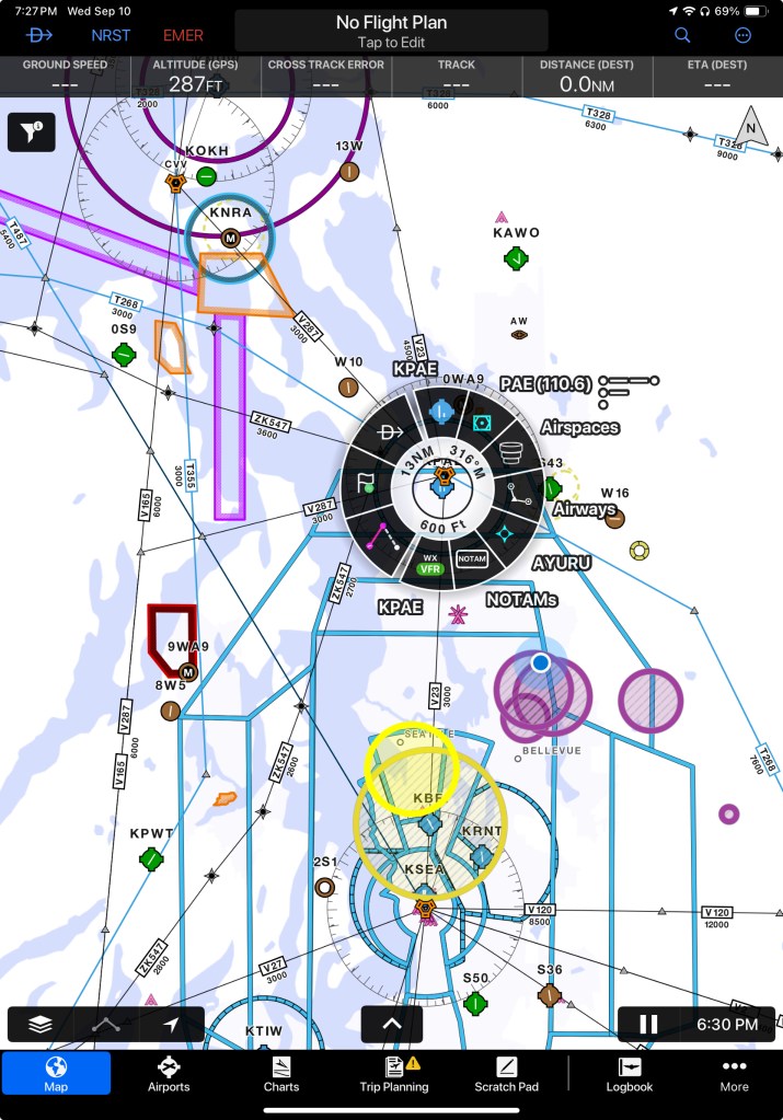
It’s a smart, layered approach that treats the map like a living, interactive system rather than a static background.
ForeFlight? Tap the map and you get… a static list of waypoints. It works, but it doesn’t feel smart. It’s like comparing a G3X to a laminated sectional chart. One is dynamic, contextual, and ergonomic; the other is just… there.
2. Contextual Instrument Charts
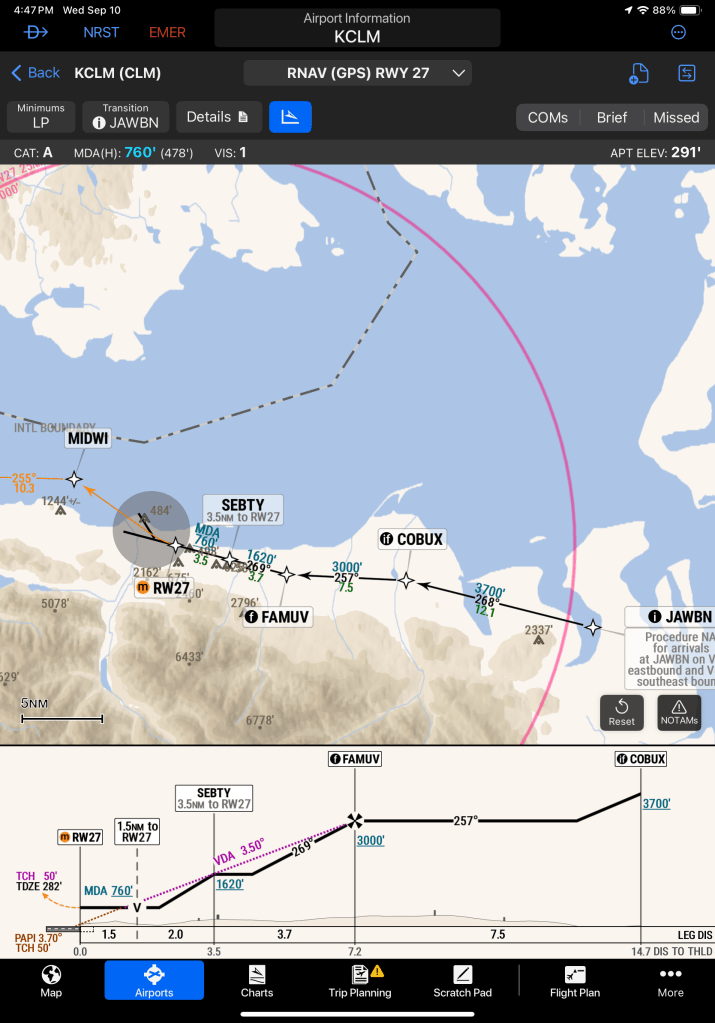
One of the most interesting areas where Garmin Pilot has pulled ahead is instrument charts. Garmin calls their new feature SmartCharts, and it’s a genuine rethinking of how an EFB can support an instrument pilot during an approach.
With SmartCharts, the chart isn’t just a static plate. It’s contextual and interactive: the app knows where you are in the procedure and highlights what’s relevant. Key frequencies, altitudes, fixes, and transitions are surfaced as you brief or fly. You can pan and zoom without clutter, toggle elements on and off, and the whole design feels like it was built from the ground up for situational awareness in the cockpit. In other words, Garmin treated this as a first-principles redesign of what approach plates could be in a digital world.
ForeFlight, a few months later, rolled out its answer: Dynamic Procedures. And while it’s a welcome addition, it feels more like a bolt-on than a rethink. The plates are essentially their existing Jeppesen/FAA charts with some dynamic overlays layered on top. Helpful? Sure. Transformative? Not really.
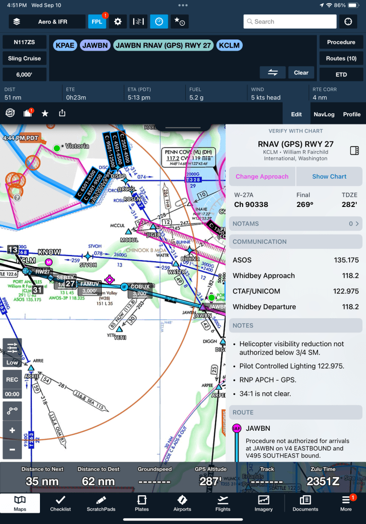
The usability gap is very clear in practice. SmartCharts behave like a next-generation cockpit display, guiding your eyes to the right information at the right time. ForeFlight’s Dynamic Procedures, on the other hand, still feel like static plates with some extra features sprinkled in. It’s the difference between designing a new tool from scratch versus patching a familiar one with new buttons.
I’ll include some image examples here, but suffice to say: SmartCharts are one of the biggest reasons I’m making the switch. They change the way you brief and fly an approach, and once you’ve used them, it’s hard to go back.
3. Price & Feature Tiers
Pricing isn’t just about dollars — it’s about what you actually get for the money. And here ForeFlight takes a pretty aggressive stance. Some of its most useful features are locked away in the highest subscription tier (Performance Plus), which costs around $370/year.
One example that really stands out: the ability to overlay weather data on the profile view of a planned flight. For an instrument pilot, that isn’t a “nice to have” — it’s safety-critical information. Knowing where weather systems intersect your climb, cruise, or descent path can completely change your planning and go/no-go decisions. Yet ForeFlight has chosen to put that behind the most expensive paywall. To me, that feels less like product design and more like revenue engineering.
Garmin Pilot, by contrast, includes features like this at a much lower price point. The Premium plan is about $210/year and already bundles contextual weather overlays and SmartCharts. It’s not just cheaper — it’s structured in a way that makes essential features accessible without squeezing pilots into the top tier.
So while ForeFlight might offer more “extra” capabilities overall, the way it gates critical features makes it feel greedy. Garmin’s tiering, on the other hand, is far more reasonable and practical for the average instrument pilot.
4. Integration with Avionics
This one is simple: if you’re flying behind a Garmin panel, Garmin Pilot just makes more sense.
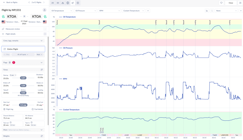
With Flight Stream, the app syncs flight plans seamlessly with the G3X, GTN, or G1000. It also pulls in Engine Indication System (EIS) data, letting you review performance logs right on your iPad after a flight.
That EIS data is hugely valuable. Services like Savvy Aviation can analyze it for long-term trends, but even a first glance at your own logs can reveal anomalies you might have otherwise missed — rising CHTs, odd fuel flow behavior, or subtle vibrations. Catching something early, before it turns into a bigger issue, can save both money and safety margins. Having that information immediately accessible in your EFB is priceless.

Now, technically you can get this data without Garmin Pilot — for example, by pulling the files off the G3X memory card and uploading them later. But that’s a chore, and in aviation, ease of use matters. The easier it is to access and review data, the more likely you are to actually use it. Garmin Pilot turns that into a one-step process instead of a post-flight project.
For me, with a Sling TSi that will be running a full Garmin panel, this integration wasn’t just a bonus — it was decisive. Why add friction when you can have your EFB and your avionics speaking the same language?
5. Industry Trends & Ownership
The last factor isn’t about features — it’s about where the companies are headed.
ForeFlight was recently acquired by a mutual fund. And if you’ve spent any time in tech, you know what that usually means: cost-cutting, higher prices, and slower innovation. The app may still get updates, but the culture shifts. It’s hard to imagine bold redesigns or major rethinking when the priority becomes quarterly returns.
Garmin, on the other hand, is investing directly into its ecosystem. Garmin Pilot isn’t just an app for them — it’s part of a larger avionics strategy. That’s why features like SmartCharts exist: they weren’t bolted on, they were engineered as a natural extension of Garmin’s hardware/software integration.
So while ForeFlight feels like a product being monetized, Garmin Pilot feels like a product being developed. And as a pilot making decisions not just for today but for the years I’ll own and fly my Sling TSi, I know which trajectory I’d rather bet on.
Wrapping It Up
Switching from ForeFlight to Garmin Pilot wasn’t about a single killer feature — it was about the overall fit. ForeFlight is still a strong app, but when I stepped back and looked at the way I fly, the cockpit I’m building, and the direction each company is headed, the choice became obvious.
At the end of the day, both apps will get you from A to B. But for me, Garmin Pilot is the app that feels purpose-built for the way I fly today, and the way I want to fly tomorrow. So as my ForeFlight subscription sunsets, I’ll be flying into the future with Garmin Pilot.


Leave a comment