
I was planning an IFR cross-country from Paine Field (KPAE) to Ellensburg (KELN). This is a trip I’ve flown before, threading across the Cascades into central Washington, but this time I wanted to plan it in Garmin Pilot instead of ForeFlight.
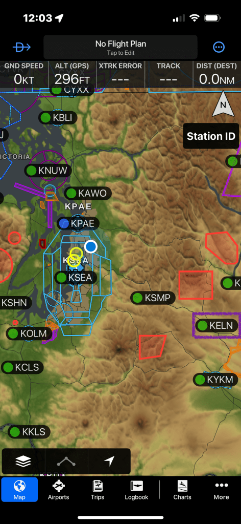
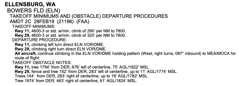
Why? Because I recently made the switch. And because Ellensburg has a fun little quirk: an Obstacle Departure Procedure (ODP) that requires you to hold at a waypoint, climb until you’re safely at the MEA, and only then turn westbound toward Seattle. It’s the sort of thing you don’t want to “oops, missed that” in IMC with granite lurking below.
So naturally, I went looking for it in Garmin Pilot. And naturally… I couldn’t find it.
Wait—Where Did Garmin Hide the ODP?
I clicked through the airport, the procedures list, the charts tab. Nothing. No ODP. Just me staring at a list of SIDs and approaches, muttering: “I know it’s here… somewhere… right?”
That’s when it hit me: Garmin Pilot isn’t just a digitized binder of FAA publications. It’s trying to rethink the entire EFB paradigm. Instead of just scanning the Terminal Procedures Publication (TPP) into your iPad, Garmin has taken the data and woven it into a more integrated workflow. Which is awesome—once you retrain your brain. But in the moment, it felt a little like wandering into IKEA looking for a hammer and realizing they’ve re-engineered it into a sleek Scandinavian hex tool.
Lost Then Found
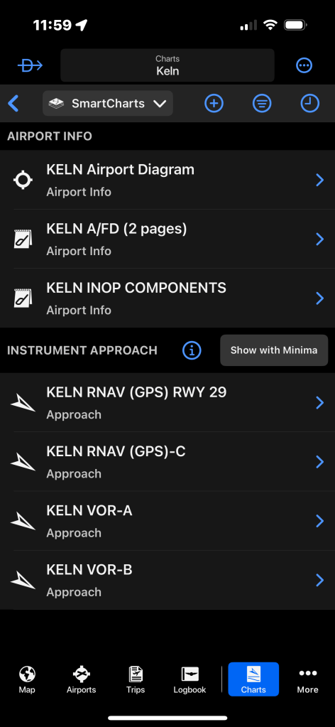
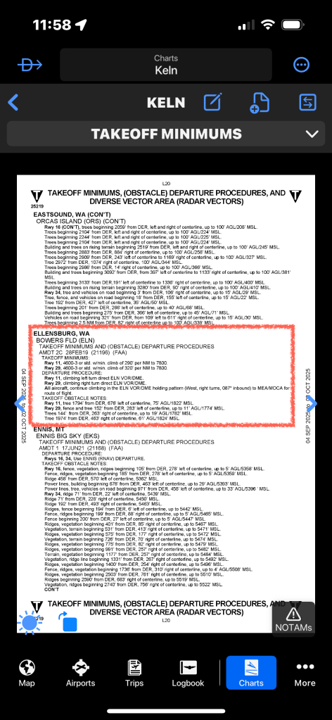
After some web sleuthing, I discovered that if I switched from SmartCharts (Garmin’s newer contextual chart system) back to FliteCharts (the “old school” chart viewer), the ODP was right there where I expected it. Proof that I wasn’t losing my mind.
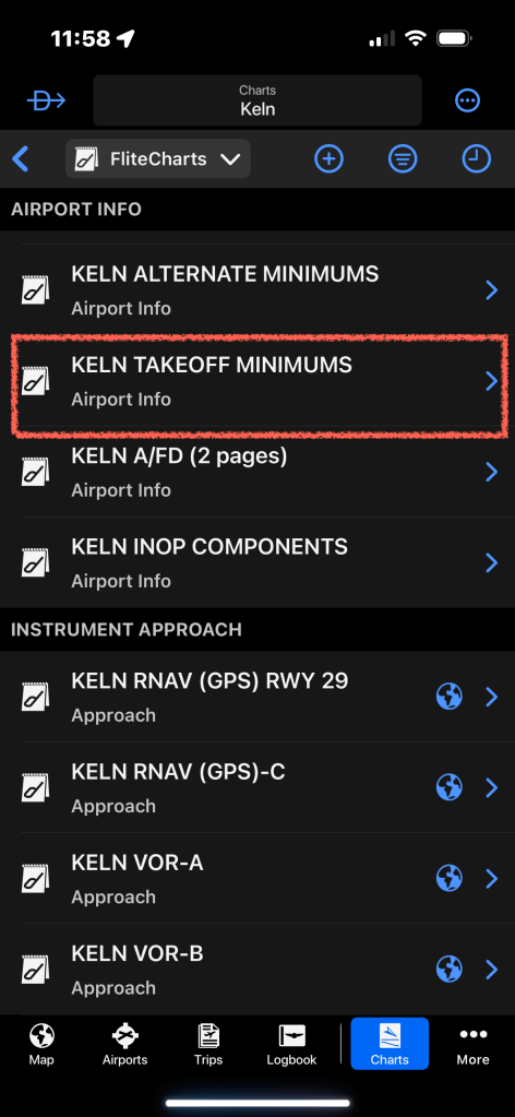
But when I flipped back to SmartCharts—poof—it was gone again. So I started poking around the menus, clicking on anything that looked promising. That’s when I stumbled into the Airport Information screen. Alongside the airport map, Garmin Pilot gives you three tabs:
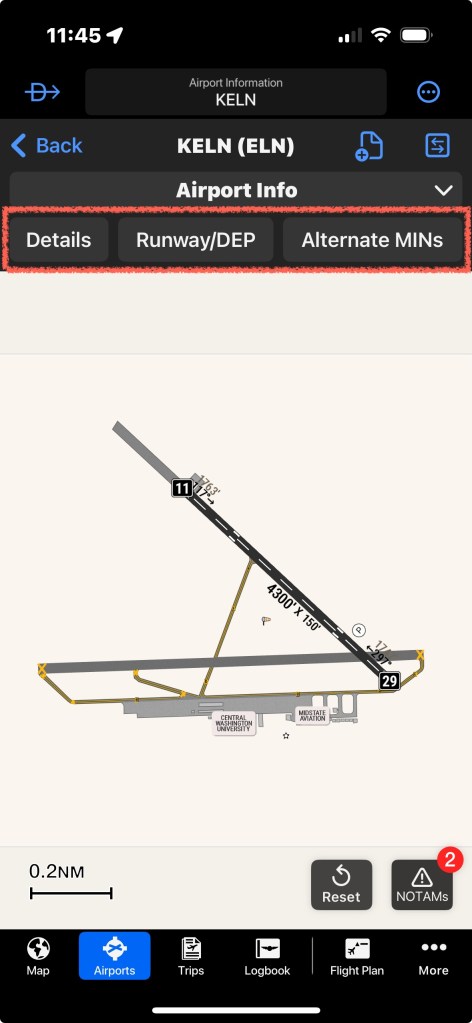
Beyond the Paper World
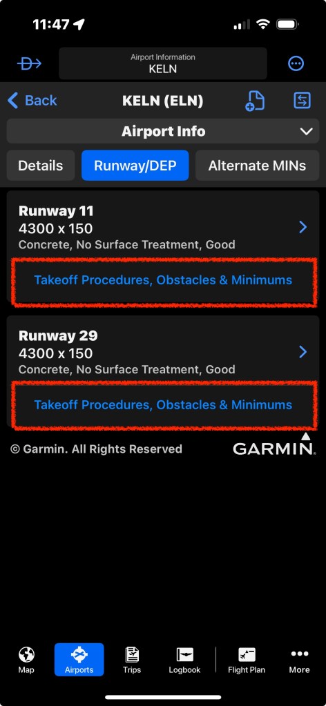
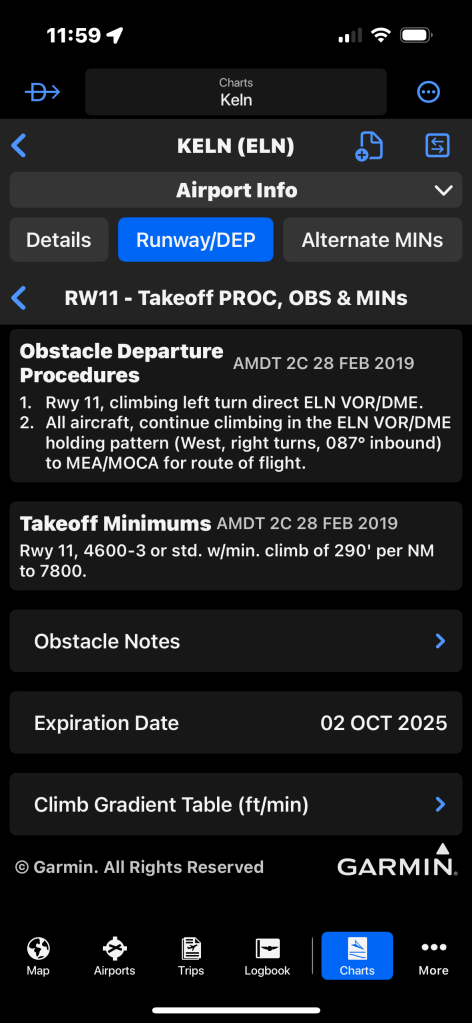
Click on Runway/DEP and suddenly it all makes sense. Garmin Pilot lays out each runway with basic information and the information from the TPP is still there, but now it’s reorganized in a way that ties directly to the runway you’ll be using.
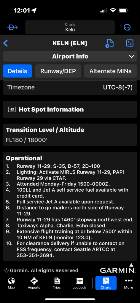
The Details tab is equally impressive. This is where Garmin has effectively taken all the information from the old Airport/Facility Directory (AFD)—which, if you’ve ever read one, is a wall of abbreviations designed to cram text onto a tiny page—and translated it into proper, readable English. Instead of decoding shorthand, you get clear, plain-language notes woven right into the airport briefing section. It feels less like deciphering hieroglyphics and more like being briefed by a fellow pilot who speaks normal human.
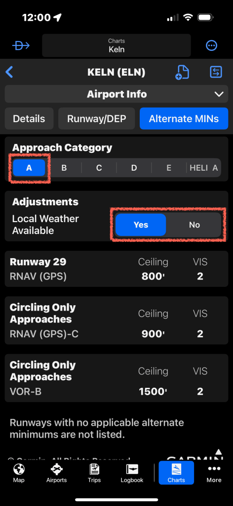
And then there’s Alternate MINs. Here Garmin Pilot doesn’t just regurgitate a static table. Instead, it pulls together all the approach minimums that are otherwise scattered across individual approach plates. Instead of flipping between multiple charts, you get a single consolidated view of every approach option at that airport. This makes trip planning far more efficient, since you can quickly see the big picture without hunting through each procedure one by one.
This isn’t just a repackaged paper chart. This is a truly electronic solution—one that thinks like a pilot in the cockpit, not like a librarian digitizing binders.
Final Thoughts
In the end, I did find the Ellensburg ODP—just not where I expected it. Garmin Pilot is teaching me that I need to let go of my “flip to the right page in the binder” mental model and instead embrace a system that’s contextual, dynamic, and deeply integrated.
Is it different? Yes. Slightly disorienting at first? A little bit. But brilliant once you see what it’s doing.


Leave a comment