Winter IFR in the Pacific Northwest has a special talent for looking mostly fine right up until it isn’t.
This is a part of the country where IMC is not an exception—it’s the baseline. Low ceilings linger for days. Moist air stacks up against terrain. Freezing levels hover just high enough to be annoying and just low enough to matter. Add weak fronts, embedded layers, and the occasional warm nose aloft, and you end up with weather that is rarely dramatic but often operationally complex.
From a pilot’s perspective, the biggest winter concerns tend to cluster around a few familiar questions:
- Where are the cloud layers really, and how thick are they?
- Where does the freezing level sit today, not in theory?
- Is there an altitude band that looks especially hostile for icing?
- Are there escape options—up, down, or lateral—if conditions don’t match the forecast?
Traditional briefing tools answer parts of these questions very well. METARs and TAFs tell you what’s happening at the surface and what’s expected to change. Freezing-level charts give you a useful big-picture view. EFBs do an excellent job summarizing winds, icing probability, and cloud forecasts along a route.
But winter IFR in the PNW often rewards pilots who think vertically, not just geographically.
This article is an introduction to one such vertical-thinking tool: Skew-T diagrams. They’re often seen as meteorologist-only artifacts, but with a small amount of context they become surprisingly practical for pilots—especially in winter.
To keep this post readable, the detailed, step-by-step explanation lives in a short companion paper that you can download here:
That paper walks through what a Skew-T diagram shows, where pilots can get them, and how to interpret them in a practical IFR preflight context—without requiring any background in meteorology. This post focuses on the “why” and the big ideas, while the paper covers the “how.”
That’s where this article starts. Not with a new tool to replace what you already use, but with an additional way to see the atmosphere you’re about to fly through.
Using Every Tool Available (Including the Ones That Look Intimidating)
Modern IFR pilots are not short on weather information.
Between METARs, TAFs, area forecasts, graphical icing products, winds aloft, satellite, radar, and increasingly sophisticated EFB features, it’s entirely possible to conduct a thorough preflight without ever leaving your tablet. Tools like vertical route profiles and icing layers already do a lot of heavy lifting, especially in winter.
This article is not about replacing any of that.
Instead, it’s about acknowledging a simple truth of winter IFR flying: when conditions are layered, marginal, or messy, it helps to understand what’s happening between the surface and your cruise altitude—not just what’s painted on the map.
Skew-T diagrams are one of the oldest weather tools around, and at first glance they look like something designed to keep pilots out rather than invite them in. Slanted lines, cryptic curves, unfamiliar scales—it’s easy to assume they require a meteorology degree to be useful.
They don’t.
In practice, a Skew-T diagram is just a vertical snapshot of the atmosphere at a specific location. It shows how temperature, moisture, and wind change as you climb. That’s information pilots already care deeply about—especially in winter—just presented in a more direct and less filtered way.
The key idea is this:
you don’t need to understand everything on a Skew-T diagram for it to be useful. You only need to know how to extract a small set of practical signals—the same ones you’re already thinking about during an IFR preflight:
- Where are the clouds, and how thick are they?
- Where does the air cross freezing?
- Is there a particular altitude band that looks especially risky?
- How do winds change as I climb?
The purpose of this article—and the companion paper it links to—is to demystify Skew-T diagrams and show how they can fit naturally alongside the tools you already use, especially when winter weather makes the answers less obvious.
Why Skew-T Diagrams Are Simpler Than They Look
At first glance, a Skew-T diagram looks like it’s trying to scare pilots away.
The slanted temperature lines, the unfamiliar curves, the dense wall of information—it’s easy to assume this is a chart meant for meteorologists, not for someone trying to decide whether today’s flight is going to involve ice, bumps, or an early return to the ramp.
That reaction is understandable. It’s also unnecessary.
Underneath the visual complexity, a Skew-T diagram is doing something very simple:
it shows how the atmosphere changes as you go up.
That’s it.
Instead of spreading weather information across multiple products, a Skew-T stacks it vertically in one place. Temperature, moisture, and wind are all plotted against altitude, giving you a single snapshot of the air you’re about to fly through at a specific location and time.

For pilots, most of what’s on the chart can safely be ignored. You don’t need to analyze every background line or understand the meteorological math behind it. In practice, IFR flying only cares about a handful of questions, and Skew-T diagrams answer those questions directly:
- Where does the air become saturated (clouds)?
- Where does the temperature cross freezing?
- How thick are those layers?
- How do winds change as altitude increases?
Once you know where to look, the diagram becomes less like a puzzle and more like a vertical briefing. The same concerns you already have during winter IFR planning—icing risk, cloud depth, escape options—are all there, just presented in a different format.
The companion paper walks through exactly how to read a Skew-T step by step.
What IFR Pilots Actually Look at on a Skew-T
For IFR preflight planning, you do not read a Skew-T diagram from top to bottom, and you certainly don’t analyze every line on it.
In practice, pilots tend to pull just a handful of signals from the chart—the same questions already running through your head when you’re looking at winter weather.
The first thing most pilots notice is the relationship between temperature and moisture. On a Skew-T, this shows up as two lines that sometimes run close together and sometimes drift apart. Where they’re close, the air is moist and clouds are likely. Where they separate, the air is dry. Following those two lines upward gives you a surprisingly clear picture of where cloud layers begin, how thick they are, and whether there are dry gaps in between. In winter IFR, this helps answer a simple but important question: how long am I going to be in the clouds?
Next comes the freezing level, which is simply the altitude where the temperature crosses zero Celsius. On the diagram, it’s easy to spot and easy to track as it rises or falls with height. More importantly, you can immediately see whether that freezing level sits inside a cloud layer or below it. That distinction matters. A cloud layer entirely above freezing is inconvenient; a cloud layer below freezing is uncomfortable; a cloud layer that straddles freezing is where icing lives.
Skew-T diagrams also make layering and inversions visible in a way surface-based tools often don’t. When temperature increases with height over a short layer, it signals an inversion. In winter, that often means stable air, trapped moisture, and widespread low IMC below the inversion—with smoother, drier air above. Seeing that structure ahead of time can help you anticipate whether climbing is likely to improve conditions or just trade one problem for another.
Finally, there’s the wind profile. Instead of a single winds-aloft value, the Skew-T shows how wind direction and speed change as you climb. This makes it easier to spot strong shear layers, unexpected headwinds, or an altitude band that looks particularly unfriendly. In winter, where turbulence and shear often live near inversions and frontal boundaries, this vertical view can explain bumps that forecasts sometimes underplay.
That’s it. Those four elements—cloud layers, freezing levels, temperature structure, and winds—are where almost all of the practical value lives for IFR pilots.
The companion paper walks through each of these in more detail, with visuals and a quick-reference cheat sheet you can keep nearby during preflight. The goal there isn’t mastery; it’s familiarity. Once you know where to look, a Skew-T stops being intimidating and starts feeling like just another briefing tool.
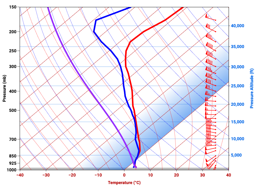
A Worked Example: Reading a Winter Skew-T Like a Pilot
Let’s make this concrete and walk through the attached Skew-T diagram the way an IFR pilot would during preflight. No decoding every line, no meteorology detours—just a practical read focused on winter flying.

The first thing to do is orient yourself. This diagram shows a vertical slice of the atmosphere from the surface at the bottom to roughly 40,000 feet at the top. The red line is the actual air temperature, the blue line is the dew point (how moist the air is), and the wind barbs on the right show how wind speed and direction change with altitude. Everything else is background noise for our purposes.
Start at the surface. Near the bottom of the chart, the temperature and dew point lines are very close together. That immediately tells you the air near the ground is nearly saturated. In winter IFR terms, this supports what you’d expect in the Pacific Northwest: low ceilings, reduced visibility, and IMC right off the runway.
Now follow those two lines upward. From the surface up through roughly 5,000 feet, the temperature and dew point remain close. They continue to track each other reasonably well all the way up to around 9,000 or 10,000 feet before beginning to separate more noticeably. That tells you this is not a thin cloud layer—it’s a deep one. If you’re climbing through this profile, you should expect to be in the clouds for a significant portion of the climb, not just popping through a shallow deck.
Next comes the critical winter question: where does the air cross freezing? On this diagram, the temperature line crosses 0°C around 4,000 to 5,000 feet. Below that altitude, you’re in above-freezing air. Above it, temperatures steadily drop as you climb. When you overlay that with the cloud information you just identified, a clear icing picture emerges. There is a band—roughly from 5,000 up to 9,000 or 10,000 feet—where the air is both saturated and below freezing. That is classic icing territory.
From a preflight perspective, this is the kind of information that sharpens your planning. Below about 4,000 feet, conditions are wet but above freezing. Above roughly 10,000 feet, the air becomes drier and icing risk likely decreases. In between is the problem layer. The Skew-T doesn’t tell you how severe icing will be, but it tells you exactly where it is most likely to live—and that’s often more actionable.
Now look at the temperature structure itself. The temperature line slopes steadily left as altitude increases, without sharp reversals or dramatic changes. That’s a stable profile. In practical terms, this is not a convective day. You’re not looking at towering buildups or thunderstorm energy. Expect widespread stratiform clouds, generally smooth air, and the kind of persistent IMC that defines winter flying in this region.
Finally, glance at the winds on the right side of the chart. Winds are relatively light near the surface and increase with altitude. Direction changes gradually as well, indicating some shear, but nothing abrupt. This suggests that while the climb may be a little bumpy as winds increase, this is not a profile screaming severe turbulence. It also hints that higher cruise altitudes may come with stronger winds—good or bad depending on your direction of flight.
You may also notice the purple line running through the diagram. This is the lifted parcel line, and it represents a simple thought experiment: what would happen to a small bubble of air near the surface if it were pushed upward. As that parcel rises, the chart shows how its temperature would change compared to the surrounding air. For pilots, the practical takeaway is limited but useful. If that purple line stays to the left of the actual temperature line, the atmosphere is stable and rising air tends to stop rising—typical of widespread stratiform clouds and generally smooth air. If it crosses to the right, the atmosphere is unstable and supports convective activity. In this particular example, the purple line never meaningfully overtakes the temperature profile, reinforcing what the rest of the chart already suggests: this is a stable, non-convective winter IFR setup, not a thunderstorm day.
Putting it all together, this Skew-T paints a very typical winter IFR picture: widespread IMC, a low freezing level, a deep icing-capable cloud layer, stable air, and improving conditions above the deck. There’s nothing dramatic here—but there is a lot of information that matters.
This is exactly where Skew-T diagrams earn their keep. They don’t replace your EFB weather products, but they explain why those products look the way they do. They help you see the vertical structure behind the forecasts and think more clearly about where the risk actually lives.
If you want a step-by-step guide to reading diagrams like this, including a quick-reference cheat sheet you can use during preflight, that’s what the companion paper is for. This example is just meant to show that once you know what to look for, Skew-T diagrams stop being mysterious and start being useful.
Practical Implications: A Winter IFR Crossing at 9,000 Feet (KPAE → KELN)
Let’s turn the example Skew-T above into an actual decision.
Imagine a winter IFR flight from Paine Field to Ellensburg, routing eastbound across the Cascades, with a planned cruise altitude of 9,000 feet. This is a very typical scenario in the Pacific Northwest—and a very unforgiving one if the vertical structure isn’t well understood.


Based on the Skew-T we just walked through, the first implication is straightforward: you will be in the clouds for most of the climb. The diagram shows a deep saturated layer from near the surface up to roughly 9,000–10,000 feet. There’s no thin stratus to pop through early. If you’re committing to this altitude, you’re committing to sustained IMC.
Next comes the freezing level. The temperature crosses 0°C around 4,000–5,000 feet, and the cloud layer extends well above that. That means the climb from roughly 5,000 up to your planned 9,000 feet takes place in subfreezing cloud—the exact environment where airframe icing is most likely. This is not speculative; the vertical structure makes it explicit. For a pilot, this reframes the question from “is icing forecast?” to “how long am I exposed to the icing band?”
At 9,000 feet specifically, the Skew-T suggests you’re near the top of the cloud layer, but not cleanly above it. That’s an important distinction. You may still be in cloud, or right at the ragged top, with temperatures well below freezing. In other words, 9,000 feet is not a guaranteed escape altitude—it’s potentially the worst place to level off, maximizing time in icing while offering limited improvement in visibility.
Now layer in the terrain. Crossing the Cascades at this altitude reduces your vertical flexibility. Descending back into warmer air may mean terrain constraints. Climbing higher might improve conditions, but only if the air actually dries out above—and only if the airplane and pilot are prepared for it. The Skew-T suggests that improvement likely occurs above 10,000 feet, not at 9,000.
From a preflight standpoint, this leads to very practical questions:
- Can I climb efficiently through the icing layer, or will I be stuck in it?
- Do I have a realistic plan to go higher if needed?
- Is delaying, rerouting, or choosing a lower-altitude west-side-only plan smarter?
- Does this profile align with my airplane’s capabilities and my personal comfort level?
None of those answers come from the Skew-T alone—but the Skew-T tells you where the risk lives, vertically. That’s the kind of insight that turns winter IFR from a guessing game into a managed decision.
This is also where Skew-T diagrams complement EFB tools particularly well. Your EFB may show icing probability along the route, but the Skew-T explains why 9,000 feet is a marginal choice and why a different altitude—or a different day—might be the better call.
Where Pilots Can Get Skew-T Diagrams (U.S.-Focused)
Skew-T diagrams are easier to access than most pilots realize. Below are reliable sources that provide either observed soundings, forecast soundings, or both. Each has a slightly different use case, so it’s worth knowing more than one.
FlyTheWeather
This is one of the most pilot-friendly ways to view Skew-T diagrams.
- Designed specifically for pilots, not meteorologists
- Clean interface with minimal clutter
- Easy access to forecast Skew-Ts
- Excellent for learning and quick preflight context
If you’re new to Skew-T diagrams, this is arguably the best place to start.
University of Wyoming Atmospheric Soundings
http://weather.uwyo.edu/upperair/sounding.html
This is the classic source for Skew-T diagrams.
- Provides observed weather balloon soundings
- Data from actual launches (typically 00Z and 12Z)
- Excellent for seeing what the atmosphere really looks like at launch time
- Less intuitive interface, but extremely reliable
Best used to understand current or recent conditions near a sounding station.
Pivotal Weather
https://www.pivotalweather.com
Excellent for forecast Skew-T diagrams.
- Click on a map to generate a forecast Skew-T anywhere
- Supports multiple forecast models (GFS, NAM, etc.)
- Lets you step forward in time to see trends
- Extremely useful for preflight planning beyond the current observation window
This is one of the best tools for seeing what the vertical structure is expected to do.
Tropical Tidbits
https://www.tropicaltidbits.com
Despite the name, this is a powerful general weather tool.
- High-quality forecast Skew-Ts
- Good visualization of temperature and moisture profiles
- Especially useful for understanding larger-scale patterns
Slightly more technical, but very accurate and respected.
How Skew-T Diagrams Complement Your EFB Weather Planning
At this point it’s worth addressing the obvious question: with everything modern EFBs already provide, why bother adding Skew-T diagrams at all?
The short answer is that EFBs and Skew-T diagrams are doing different jobs.
Your EFB excels at turning massive amounts of weather data into actionable summaries. It tells you where icing is likely, where clouds are forecast, what the freezing level is, and how winds change along your route. For most IFR flights, that’s more than sufficient—and this article isn’t suggesting otherwise.
What Skew-T diagrams add is context.
EFB products are necessarily filtered and averaged. A freezing-level chart gives you a single number. An icing product gives you a probability. A vertical profile gives you a simplified slice along a route. All of that is extremely useful—but it smooths over the vertical complexity that often defines winter IFR in the Pacific Northwest.
A Skew-T doesn’t replace those tools; it helps explain them. It shows why the freezing level matters, where the icing band actually sits relative to cloud layers, and how thick those layers are. When an EFB says “icing possible between 6,000 and 10,000 feet,” the Skew-T lets you see whether that’s a narrow slice you can climb through quickly or a deep, persistent layer that demands a more conservative plan.
This becomes especially valuable on days when forecasts feel marginal or slightly contradictory—when cloud tops vary by a few thousand feet, when freezing levels wobble, or when icing probabilities don’t quite line up with what you expect. In those cases, the Skew-T acts as a second lens on the same atmosphere, giving you confidence that your mental picture matches reality.
The key point is that Skew-T diagrams are not an alternate workflow. You don’t brief them instead of your EFB—you glance at them because you’ve already briefed your EFB. They’re a way to sanity-check assumptions, sharpen altitude decisions, and better understand where the risk actually lives vertically.
In winter IFR, especially over terrain, that added vertical awareness can be the difference between a plan that looks reasonable on paper and one that’s genuinely well thought out.
Bringing It All Together
Skew-T diagrams aren’t about turning pilots into meteorologists. They’re about seeing the atmosphere you’re about to fly through in a way that matches how airplanes actually move—vertically.
In winter IFR, especially in the Pacific Northwest, much of the risk lives between the surface and your cruise altitude. Freezing levels sit uncomfortably low. Cloud layers are deep and persistent. Small altitude changes can mean the difference between wet air and ice, smooth air and bumps, or an easy out and a constrained one. Skew-T diagrams make those vertical relationships visible.
The key is to keep expectations realistic. You don’t need to analyze every line or understand every concept on the chart. For IFR preflight, you’re looking for a handful of practical signals: where the clouds are, where temperatures cross freezing, how thick the risky layers are, and how winds change as you climb. Once you know where to look, a Skew-T becomes less of a chart to “decode” and more of a quick vertical briefing.
That’s also why this tool works best as an addition, not a replacement. Your EFB already does an excellent job summarizing weather and turning it into clear guidance. Skew-T diagrams help explain why that guidance looks the way it does, and they give you confidence when conditions are marginal or layered.
If this article sparked your curiosity, the companion paper linked above walks through Skew-T diagrams step by step, with visuals and a simple cheat sheet you can keep handy during preflight. It’s designed to be short, practical, and approachable—something you can skim before a winter flight and immediately put to use.
Used occasionally and intentionally, Skew-T diagrams become one more way to reduce surprises, especially on the kinds of winter IFR days where good decisions depend on understanding what’s happening above you, not just around you.


Leave a Reply